Astrology Elements Distribution over a Few Years. Visualization. Pandas. Seaborn
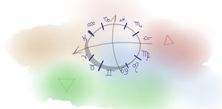
The four elements Fire, Water, Earth and Air describe an object with a set of their own characteristics, such as being active, perceptive, structured, versatile. By understanding all the other characteristics and the specific composition of elements, we can attempt to profile an object. But what if that object is a calendar year? In such a case, to create a profile, the daily elements ratio has to be computed.
The idea of the year profile came to my mind while i was learning about the subjects of Elements and Modality in an astrology class. The profile, I believe, would lead to a better understanding of the elements and how to perceive them as a whole along with modality. I think that comparing three consecutive years - the previous, current, and upcoming - side by side would enhance profile understanding, as we all discover our lives in the same way.
Generating Data. Elements Per Day
I have a few candidates to assist me in generating planet positions at the zodiac sign per day - kerykeion , pyswisseph , and flatlib . The data generated will be grouped up and visualized. While Pyswisseph is considered the industry standard library, flatlib serves as its wrapper. Kerykeion appears to be redundant. Personally, I prefer using a wrapper as it's a better fit for this task. Flatlib allows us to obtain a data record datetime, planet, sign with just a few lines of code.
To compute the ratio the element points are summarized in according to a zodiac sign where a planet of 10 is placed at a given moment of time in a specific location, one planet is one point. Planets are Sun, Mercury, Venus, Mars, Jupiter, Saturn, Uranus, Neptune, and Pluto. The location is Moscow, the time is 12pm.
from flatlib.datetime import Datetime
from flatlib.geopos import GeoPos
from flatlib.chart import Chart
from flatlib import const

LIST_OBJECTS = const.LIST_OBJECTS[:-5]

def make_chart(date, time='12:00', timezone='+03:00', moscow_lat=55.752121, moscow_long=37.617664):
    date = Datetime(date, time, timezone)
    pos = GeoPos(moscow_lat, moscow_long)
    chart = Chart(date, pos, IDs=LIST_OBJECTS)
    return chart
I've never used Flatlib library before, so I've conducted a small comparison between the generated data and two third-party natal chart builders - astro-seek.com and sotis-online.ru to ensure a full match. The date chosen is 2023/09/14, which is the beginning of writing this article. The output displays all planets and their corresponding zodiac signs.
chart = make_chart('2023/09/14')

ELEMENTS = {'Aries': 'Fire',
            'Leo': 'Fire',
            'Sagittarius': 'Fire',
            'Cancer': 'Water',
            'Scorpio': 'Water',
            'Pisces': 'Water',
            'Taurus': 'Earth',
            'Virgo': 'Earth',
            'Capricorn': 'Earth',
            'Gemini': 'Air',
            'Libra': 'Air',
            'Aquarius': 'Air'}

for obj_id in const.LIST_OBJECTS[:-5]:
    obj = chart.getObject(obj_id)
    try:
        print(obj.id, '-', obj.sign, '-', ELEMENTS[obj.sign])
    except:
        pass
| Flatlib Data | Astro-Seek | Sotis |
|---|---|---|
| Sun - Virgo - Earth Moon - Virgo - Earth Mercury - Virgo - Earth Venus - Leo - Fire Mars - Libra - Air Jupiter - Taurus - Earth Saturn - Pisces - Water Uranus - Taurus - Earth Neptune - Pisces - Water Pluto - Capricorn - Earth |
 |
 |
The generated output and that is in two pictures match completely, the data credibility confirmed.
Okay, it's now time to create a DataFrame for all the days of the year 2023.
import pandas as pd

MODALITIES = {'Aries': 'Cardinal',
            'Cancer': 'Cardinal',
            'Capricorn': 'Cardinal',
            'Libra': 'Cardinal',
            'Leo': 'Fixed',
            'Scorpio': 'Fixed',
            'Taurus': 'Fixed',
            'Aquarius': 'Fixed',
            'Sagittarius': 'Mutable',
            'Pisces': 'Mutable',
            'Virgo': 'Mutable',
            'Gemini': 'Mutable'}

def make_record(timestamp):
    chart = make_chart(timestamp.strftime('%Y/%m/%d'))
    record = tuple(chart.getObject(id_).sign for id_ in LIST_OBJECTS)
    return record

def make_year_df(year: str):
    year_range = pd.date_range(start=pd.to_datetime(year),
                               end=pd.to_datetime(year) + pd.offsets.YearEnd(),
                               freq='D')
    records = [make_record(timestamp) for timestamp in year_range]
    df = pd.DataFrame(index=year_range, columns=LIST_OBJECTS, data=records)

    year_df = df.melt(var_name='Planet',
                      value_name='Sign',
                      ignore_index=False)\
    			.sort_index()
    year_df['Element'] = year_df['Sign'].map(ELEMENTS)
    year_df['Modality'] = year_df['Sign'].map(MODALITIES)
    return year_df

year_df = make_year_df('2023')
| Planet | Sign | Element | Modality | |
|---|---|---|---|---|
| 2023-12-17 00:00:00 | Venus | Scorpio | Water | Fixed |
| 2023-05-05 00:00:00 | Pluto | Aquarius | Air | Fixed |
| 2023-02-10 00:00:00 | Pluto | Capricorn | Earth | Cardinal |
| 2023-09-25 00:00:00 | Mercury | Virgo | Earth | Mutable |
| 2023-11-11 00:00:00 | Mercury | Sagittarius | Fire | Mutable |
The full year data year-2023-data.tar.bz2
The sample above also contains two additional columns, Element and Modality. Both of them derive from a zodiac sign's astrological properties. For example, Virgo is a Mutable sign of the Earth element.
The Elements Ratio Chart
The table with all the necessary data of the year is prepared. We are approaching to a visual part of the research. The distribution type of a chart is chosen to display the elements as the ratio areas with their corresponding colors.
import seaborn as sns

ax = sns.kdeplot(data=year_df,
			x=year_df.index,
            hue='Element',
            multiple='fill',
            cut=0,
			palette={'Fire': '#EE1D23', 'Water': '#23B24B', 'Earth': '#DE6B27', 'Air': '#4D87C6'})
sns.move_legend(ax, "lower center", bbox_to_anchor=(.5, 1), ncol=4, title=None, frameon=False)

It looks nice. Obviously, the major part of the area is taken up by the Earth and Water elements. Other observations will be detailed in the final section of the article. The next step is modality ratio visualization .
The Modality Ratio Chart
The way of data generation is the same as of elements.
Modality, in other words, is element dynamic. All the elements consist of three dynamic types - Cardinal, Fixed, Mutable which corresponds to three Zodiac Sign of the same element. Cardinal signs initiate. Fixed signs bring stability and endurance. Take Modality into account with element to predict their influence.
ax = sns.kdeplot(data=year_df,
                x=year_df.index,
                hue='Modality',
                multiple='fill',
                cut=0,
                palette={'Cardinal': '#5d5d5d', 'Fixed': '#8b8b8b', 'Mutable': '#b0b0b0'})
sns.move_legend(ax, "lower center", bbox_to_anchor=(.5, 1), ncol=4, title=None, frameon=False)
|
 |
|---|
Nice, the major tendencies are visible on the both charts. Before listing thoughts i see there, charts should be enhanced visually.
Enhanced Appearance
To better focus on valuable information, it's best to combine both charts into one image. Remove unnecessary ticks and labels, and create a shared timeline on the X-axis. Replace dates with the names of the months.
Add a background with with a fit picture. Define a specific color order to disable automatic placing of areas on the chart. Finally, add a title.
The elements part should be placed at the bottom, outlined with bold, dark lines, while the modality part should be placed on top. We slide our eyes once upside down and then fixate them at the bottom.
import matplotlib.pyplot as plt
import matplotlib.image as mpimg
from matplotlib import dates as mdates

def make_improved_chart(df):
    with sns.plotting_context({'ytick.labelsize': 0, 'ytick.major.size': 0, 'ytick.minor.size': 0, 'axes.labelsize': 0}):

        with sns.axes_style(style='white'):
            fig, (ax1,ax2) = plt.subplots(2,1)
            image = mpimg.imread('files/texture-background-cropped.png')
            ax = sns.kdeplot(data=df,
                            x=df.index,
                            hue='Modality',
                            hue_order=['Cardinal', 'Fixed', 'Mutable'],
                            multiple='fill',
                            cut=0,
                            palette={'Cardinal': '#5d5d5d', 'Fixed': '#8b8b8b', 'Mutable': '#b0b0b0'},
                            ax=ax1)
            sns.move_legend(ax, "lower center", bbox_to_anchor=(.5, 1), ncol=4, title=None, frameon=False)
            ax.imshow(image, aspect=ax.get_aspect(), extent=ax.get_xlim() + ax.get_ylim(), zorder=0.5, alpha=0.2)
            ax.set(xticklabels=[])
            ax.tick_params(bottom=False)
            sns.despine(ax=ax, left=True, bottom=True)

        image = mpimg.imread('files/element-background.jpg')
        ax = sns.kdeplot(data=df,
                        x=df.index,
                        hue='Element',
                        hue_order=['Earth', 'Air', 'Fire', 'Water'],
                        multiple='fill',
                        cut=0,
                        palette={'Fire': '#EE1D23', 'Water': '#23B24B', 'Earth': '#DE6B27', 'Air': '#4D87C6'},
                        ax=ax2)
        sns.move_legend(ax, "lower center", bbox_to_anchor=(.5, 1), ncol=4, title=None, frameon=False)
        ax.imshow(image, aspect=ax.get_aspect(), extent=ax.get_xlim() + ax.get_ylim(), zorder=0.5, alpha=0.9)
        ax2.xaxis.set_major_locator( mdates.MonthLocator())
        ax2.xaxis.set_major_formatter(mdates.DateFormatter('%B'))

    plt.suptitle(f'Temper of {df.index[0].year} Year', fontsize=30, fontweight='medium', fontfamily='Noto Sans')

make_improved_chart(year_df)

It looks much better.
The final step, put the charts of three years in one line, running code make_improved_chart(make_year_df('year')).
 |
|
 |
|---|
Takeaways
Well, the job is done, data generated and visualized, what i would like to say about what i see:
- 2022 is more Cardinal than the others.
- Cardinality decreases, while Mutability increases over three years.
- The year 2023 year contains a lot of Earth and Water in comparison to 2022, 2024.
- In 2023, between July and September there is a lack of Air.
- In 2023, between October and November there is a lack of Fire.
- 2024 is more Mutable than the others.
- The Earth ratio in 2024 is reduced, while the Air's one is significantly increased.
- The elements ratio for 2022 and 2024 are equal, while modality's is polarized.
I, intentionally, didn't write my own interpretation here. The characteristics of elements and modality will help you to make your own view, take your time.