Explore and visualize the parser events and performance. Pandas. Seaborn. KLib. ADTK
First, i was going to start writing an article about researching Plotly community and changed my mind after a short while in favor of exploring how a multithreaded parser that i've implemented discourse-parser for the purpose of whether getting the community data runs performant. Did it have performance issues? Is a way of data requesting and writing worked as expected due to multithreading? Was parsing completed correctly and had no anomalies?
While the parser was working it produced a lot of logs, each log record is a specific type of event representing activity a thread is doing at a moment, for example data.get to request a community website. Those log records are the target to explore, visualize, and get insights from. Also, they are time series.
For a broad view on the concerns the article is split into the following sections:
- Logs Overview.
- Continuous Running Index.
- Events frequency.
- Network Latency Time Series.
- Write on Disk Time Series.
Logs Overview and Sample
The logs file parser-latest-log.tar.bz2 that is produced by the parser to uncompress and read. Each log record inside is nothing than a json line generated by the structlog logging library. I like using that lib for events tracking. Let's print a sample of the records.
# Dataset
import tarfile
import json
import pandas as pd

with tarfile.open('files/parser-latest-log.tar.bz2') as tfile:
    file = tfile.extractfile('parser-latest-log.txt')
    logs_data = file.read().decode()

json_lines = [json.loads(line) for line in logs_data.splitlines()]
df = pd.DataFrame.from_records(json_lines)
df['timestamp'] = pd.to_datetime(df['timestamp'])
# Table
df.sample(5).to_markdown(index=False)
| event | timestamp | thread_name | target | args | path | exc_info |
|---|---|---|---|---|---|---|
| data.get | 2023-03-12 11:55:59.029086+00:00 | Consumer-11 | topic | {'page': '68', 'id': 67797} | nan | nan |
| data.get | 2023-03-12 12:23:21.008310+00:00 | Consumer-6 | topic | {'page': '232', 'id': 52642} | nan | nan |
| data.saved | 2023-03-12 12:59:10.965976+00:00 | Consumer-12 | topic | {'page': '447', 'id': 34298} | latest/order-created/ascending-False/page-447/topic-34298-2023-03-12T11:44:38+00:00.json | nan |
| data.saved | 2023-03-12 11:59:56.268552+00:00 | Consumer-2 | topic | {'page': '91', 'id': 65603} | latest/order-created/ascending-False/page-91/topic-65603-2023-03-12T11:44:38+00:00.json | nan |
| task.get | 2023-03-12 11:46:53.948818+00:00 | Producer-2 | latest | nan | nan | nan |
The handy library klib brings a brief dataset overview visualizing categories(a few column in the sample table), the most and least frequent value counts, values density per category. There are three categories we need to plot event, thread_name, target. The others args, path, exc_info are for the debugging purpose, timestamp is considered in other sections.
import matplotlib.pyplot as plt
import klib

klib.cat_plot(df[['event', 'thread_name', 'target']])
plt.suptitle('')

As mentioned, there are two bloks representing each column, frequency and density. Density is a bottom block filled in with the thin lines, those lines are the most and least frequent values in the upper block. Zoom in the image to see text details.
A few interesting facts from the image:
- The
event's most filled the vertical bar with teal color almost full77.0% - While the
thread_name's most are not so frequent within all the category values, its vertical bar contains a lot of white color that means filling in with other values. - In the
targetbar only two unique values and the most frequent valuetopicfilled the bar in for93.6%
Continuous Running Index
The index is simply a number that is expected to be constant, doesn't matter what a value is. Constant means there were no interruptions of parser running. The basic way to visualize such the number is just a line, straight line. So, Is that line straight?
# Dataset
threads_df = df[~df['thread_name'].str.startswith('Main')]

events_per_min_df = threads_df.set_index('timestamp')\
						.pivot(columns='event', values='event')\
						.resample('min')\
						.count()\
						.loc[:, ['task.get', 'data.get', 'data.received', 'data.saved']]

ts_diff_df = events_per_min_df.reset_index()\
				.diff()\
				.loc[:, 'timestamp']
ts_diff_df = ts_diff_df.dt.seconds / 60  # Convert to minutes
ts_diff_df.rename('Diff in minutes', inplace=True)
# Plot
import seaborn as sns

sns.set_theme(style='white', context={'axes.labelsize': 16, 'axes.titlesize': 16, 'legend.fontsize': 16})
sns.set_palette('pastel')
sns.set_style({'axes.spines.left': False, 'axes.spines.bottom': False, 'axes.spines.right': False, 'axes.spines.top': False})

line = sns.lineplot(data=ts_diff_df, lw=4)
last_pos = line.get_xticks()[-2]
line.set_xticks([1, last_pos],
                labels=[events_per_min_df.index.min().strftime('%H:%M:%S'),
                        events_per_min_df.index.max().strftime('%H:%M:%S')])
line.figure.suptitle('Continuous Index', size=20)
line.figure.subplots_adjust(top=.9)

Throughout all the running timeTimedelta('0 days 02:20:00') there were no interruptions as the straight line of constant value 1 means that difference between every consequent ticks is 1 min, no more no less.
Events Frequency
event is the most valuable category in a parser work. We can manually count and interpret logs for how many each event type was produced, whom, when, etc. That way works fine if log records are a few, that's not our case. Records are thousands, print the dataset shape df.shape[0] is 112880.
Frequency Per Target
To make a general picture about all the events we can group them up into 5 minutes bins(groups) and split per target to visualize the dataset in different dimensions at the same time. Grouping into small time ranges(bins) with event frequency(count) calculation is being made for having data visualization easy to interpret. So, we will see how often each event type is produced per target within 5 min bins.
Only the events task.get, data.get, data.received, data.saved are left as the rest is about technical tracking and errors. Errors should be considered separately, i've manually checked their count and they are a couple.
# Datset
sub_df = df.drop(columns=['args', 'path', 'exc_info'])\
	.dropna(subset=['target'])\
	.loc[:, ['timestamp', 'event', 'target', 'thread_name']]\
	.sort_index(axis=1)

events_occured_df = sub_df.pivot(index='timestamp',
                                 columns=['thread_name', 'target', 'event'],
                                 values='event')\
	.mask(lambda df: df.notna(), 1)\
	.fillna(0)\
    .melt(ignore_index=False)\
    .query('value == 1')\
	.drop(columns='value')\
    .sort_index()

cut_bins = pd.date_range(start=events_occured_df.index.min() , end=events_occured_df.index.max() + pd.Timedelta(minutes=5), freq='5min')
cut_labels = list(f'{i}th' for i in range(5, len(cut_bins) * 5, 5))

events_reduced_df = events_occured_df[~events_occured_df['event'].isin(['do', 'done', 'stop.blank', 'error.http'])]
events_reduced_df.loc[:, '5min bin'] = pd.cut(events_reduced_df.index,
                                              bins=cut_bins,
                                              labels=cut_labels,
                                              include_lowest=True)
# Plot
displot = sns.displot(data=events_reduced_df,
                      x='5min bin',
                      hue='event',
                      col='target',
                      row='event',
                      multiple='stack')
loc, labels = plt.xticks()
displot.set_xticklabels(labels, rotation=45)
displot.fig.suptitle('Events Frequency Over Targets', size=20)
displot.fig.subplots_adjust(top=.9)

Nice, right away we see:
- That event's amount of the target
latestis an order smaller than oftopic. - The event
task.getamount is bigger at both targets than other event types, but it's not representative of the plot type. It can be depicted better.
Visualizing the event amount as a ratio could help with the feeling of how much bigger task.get is.
with sns.axes_style('whitegrid'):
    displot = sns.displot(data=events_reduced_df,
                          x=events_reduced_df['5min bin'].apply(lambda val: val.removesuffix('th'))\
                                .astype(int)\
                                .rename('5min int bin'),
                          hue='event',
                          col='target',
                          multiple='fill',
                          kind='kde')
    displot.fig.suptitle('Events Frequency Ratio', size=20)
    displot.fig.subplots_adjust(top=.9)

Much more clear now:
task.getof the targettopicis around1.0 - 0.7,0.3of the whole. It looks balanced.- While
task.getof the targetlatestis around1.0 - 0.35,0.65is quite big.
Frequency Per Thread
A similar way to the frequency above the dataset is plotted, but a per thread dimension. How often each event type is produced per thread_name within 5 min bins.
displot = sns.displot(data=events_reduced_df, x='5min bin', hue='event', col='thread_name', col_wrap=2, multiple='stack')
loc, labels = plt.xticks()
displot.set_xticklabels(labels, rotation=45)
displot.fig.suptitle('Events Frequency Over Threads', size=20)
displot.fig.subplots_adjust(top=.9)

The picture shows that each thread workload looks the same. That's a good observation, it means the parser was working as expected.
Network Latency Time Series
The network latency is a time delta between the events data.received, data.get. In order to compute all the deltas, the dataset has to be sorted by two columns timestamp, thread_name to avoid misplacing when, for example, event data.get is followed by data.get but of a different thread.
The valid event order:
task.getdata.getdata.receiveddata.saved
Check the events order validity
To check that an order after sorting is valid two columns should be added, the previous and next event. After columns are added, we can match accordingly to valid event order above each event with its previous and next to state it is valid in according to.
# Dataset
order_state_df = events_reduced_df.reset_index()\
    .sort_values(['thread_name', 'timestamp'], ascending=True)\
    .assign(prev_event=lambda df: df['event'].shift(1),
    		next_event=lambda df: df['event'].shift(-1))
# Table
order_state_df[order_state_df['thread_name'] == 'Consumer-1']\
	.iloc[10:16]\
	.loc[:, ['timestamp', 'event', 'prev_event', 'next_event']]
| timestamp | event | prev_event | next_event |
|---|---|---|---|
| 2023-03-12 11:44:48.148145+00:00 | data.received | data.get | data.saved |
| 2023-03-12 11:44:48.150142+00:00 | data.saved | data.received | task.get |
| 2023-03-12 11:44:48.150436+00:00 | task.get | data.saved | data.get |
| 2023-03-12 11:44:48.150829+00:00 | data.get | task.get | data.received |
| 2023-03-12 11:44:52.154315+00:00 | data.received | data.get | data.saved |
| 2023-03-12 11:44:52.155328+00:00 | data.saved | data.received | task.get |
The sample looks valid, now define a function with valid event order matching assigning results to new column is_valid.
# Dataset
def is_order_valid(series):
    if series['event'] == 'data.get':
        return series['prev_event'] == 'task.get'
    if series['event'] == 'data.received':
        return series['prev_event'] == 'data.get'
    if series['event'] == 'data.saved':
        return series['prev_event'] == 'data.received'
    return None

order_state_df['is_valid'] = order_state_df.apply(is_order_valid, axis=1)
# Table
order_state_df[['timestamp', 'event', 'prev_event', 'is_valid']].iloc[10:16]
| timestamp | event | prev_event | is_valid |
|---|---|---|---|
| 2023-03-12 11:44:48.148145+00:00 | data.received | data.get | True |
| 2023-03-12 11:44:48.150142+00:00 | data.saved | data.received | True |
| 2023-03-12 11:44:48.150436+00:00 | task.get | data.saved | |
| 2023-03-12 11:44:48.150829+00:00 | data.get | task.get | True |
| 2023-03-12 11:44:52.154315+00:00 | data.received | data.get | True |
| 2023-03-12 11:44:52.155328+00:00 | data.saved | data.received | True |
is_valid marks rows as a boolean flag. Now we can group the dataset with and without is_valid flag, just to visualize if group counts are different.
with sns.plotting_context({'ytick.labelsize': 16, 'xtick.labelsize': 0, 'xtick.major.width': 0,  'axes.labelsize': 0}):
    fig, axes = plt.subplots(2, 1, sharey=False)
    event_counts = order_state_df['event'].value_counts(dropna=False)\
    									  .reset_index()
    barplot = sns.barplot(data=event_counts,
						  ax=axes[0],
                          y='event',
                          x='count',
                          color=sns.colors.xkcd_rgb['light blue'])
    axes[0].title.set_text('Unvalidated Event Counts')
    for i in barplot.containers:
        barplot.bar_label(i, fontsize=16)

    valid_event_counts = order_state_df[['event', 'is_valid']]\
    						.value_counts(dropna=False)\
    						.reset_index()\
                            .assign(group=lambda df: df['event'].astype(str) + ' - ' + df['is_valid'].astype(str))
    barplot = sns.barplot(data=valid_event_counts,
                          ax=axes[1],
                          y='group',
                          x='count',
                          color=sns.colors.xkcd_rgb['light blue'])
    axes[1].title.set_text('Validated Event Counts')
    for i in barplot.containers:
        barplot.bar_label(i, fontsize=16)

Obviously, all the events are valid due to all the counts on the top and bottom charts are equal. Consequently, network latency computing can be done with no data filtering or cleaning. The whole dataset completely match valid event order, further computed time deltas are correct.
Latency Overall
Subtract the data.get timestamp from data.received one. For making it, a new column prev_event_timestamp is added that contains timestamps of data.get. Latency are seconds.
# Dataset
latency_diffs = order_state_df.assign(prev_event_timestamp=lambda df: df['timestamp'].shift(1))\
                    .loc[lambda df: df['event']=='data.received', :]\
                    .loc[lambda df: df['is_valid'] == True]\
                    .assign(latency=lambda df: df['timestamp'] - df['prev_event_timestamp'])\
                    .assign(latency_sec=lambda df: df['latency'].dt.total_seconds())\
                    .loc[:, ['timestamp', 'thread_name', 'latency_sec']]
# Plot
latency_diffs.set_index('timestamp')['latency_sec'].plot()

Interesting, the average latency lays in between 2.5 and 5.0 seconds, at the same time there is plenty of bigger values.
Plot the latency distribution and see second groups.
with sns.plotting_context({'xtick.major.width': 0,  'axes.labelsize': 0}):
    sns.histplot(latency_diffs, y='latency_sec', color='tab:red')

Ok, now the picture is more clear. Visually, i would split the distribution in three main groups:
0.0 - 2.52.5 - 6.016.0 - 20.0
To prove the assumption i'm binning the data and compare what we see to the exact distribution values per bin.
# Table
latency_bins = pd.cut(latency_diffs['latency_sec'], 10)\
	.value_counts()\
	.sort_index()\
	.transpose()
humanized_categories = [f'{inv.left:.1f} - {inv.right:.1f} seconds'
                        for inv in latency_bins.index.categories]
latency_bins.index = latency_bins.index.rename_categories(humanized_categories)
| latency_sec | count |
|---|---|
| 0.3 - 2.3 seconds | 5445 |
| 2.3 - 4.3 seconds | 19527 |
| 4.3 - 6.4 seconds | 583 |
| 6.4 - 8.4 seconds | 4 |
| 8.4 - 10.4 seconds | 0 |
| 10.4 - 12.5 seconds | 0 |
| 12.5 - 14.5 seconds | 0 |
| 14.5 - 16.5 seconds | 0 |
| 16.5 - 18.6 seconds | 10 |
| 18.6 - 20.6 seconds | 408 |
The exact bin counts(second groups) in the table are quite close to the assumption.
Now the latency overall statistics are plotted.
with sns.axes_style('darkgrid', {'axes.facecolor': '.9'}):
    sns.boxplot(x=latency_diffs['latency_sec'], width=0.4)

The average latency_diffs['latency_sec'].mean() is 3.56 seconds, so a network request takes quite long time, therefore, having the parser multithreaded speeds up its performance significantly.
All would be fine, but i'm not sure that the statistics is correct per thread. Probably, the performance is different in respect of a thread type.
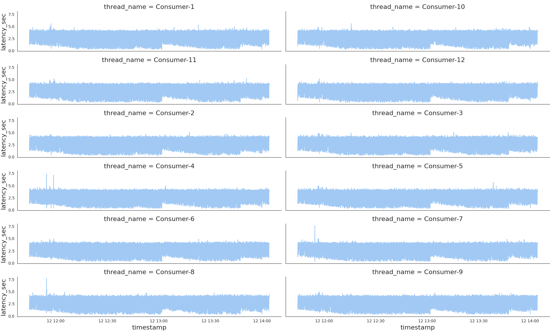
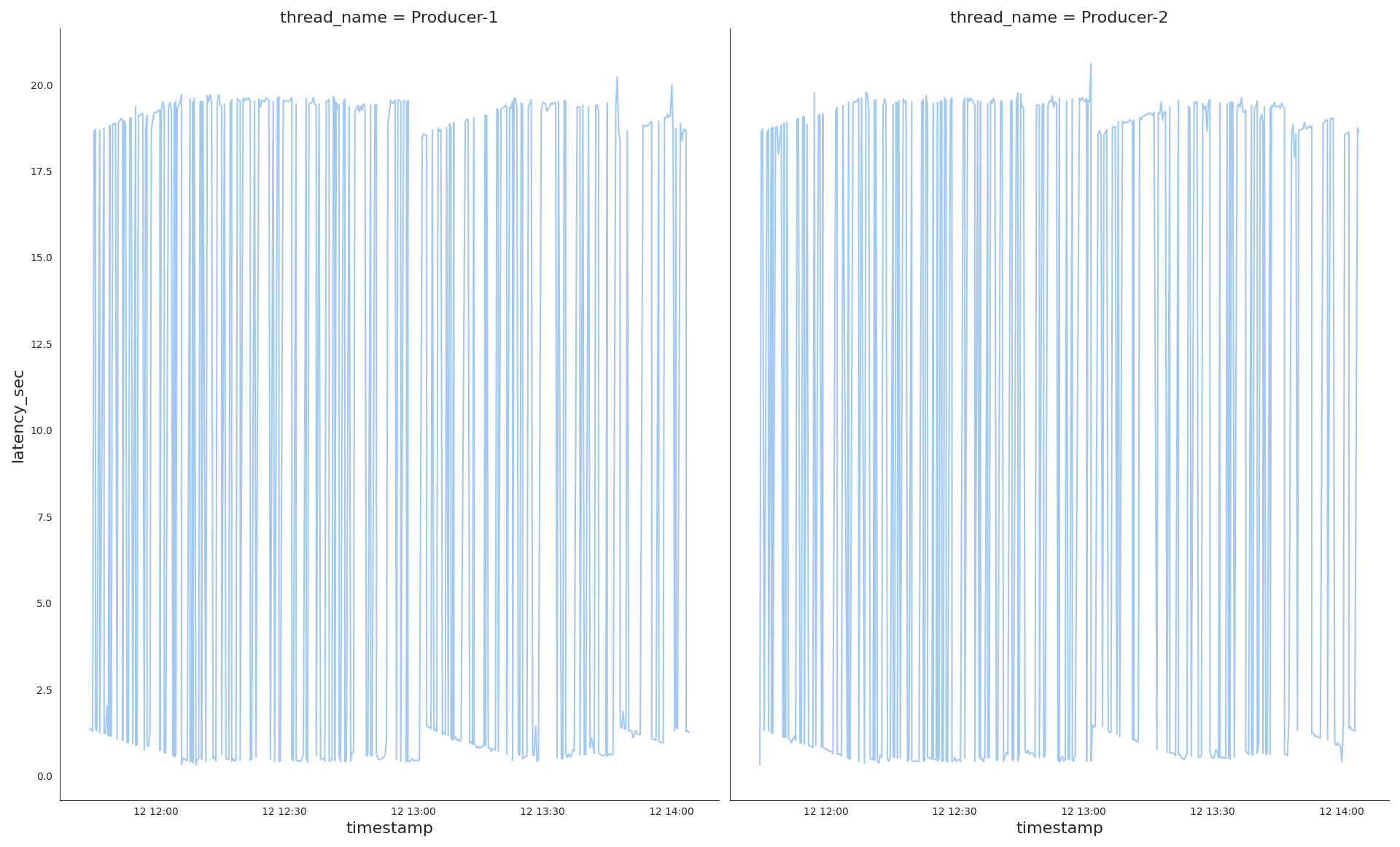
Per Thread Latency
Now we plot latency per thread and find out differences.
sns.relplot(kind='line', data=latency_diffs,
            x='timestamp',
            y='latency_sec',
            col='thread_name',
            col_wrap=2)
# Attached plot files
sns.relplot(kind='line', data=latency_diffs.loc[lambda s: s['thread_name'].str.startswith('Consumer')], x='timestamp', y='latency_sec', col='thread_name', col_wrap=2)
sns.relplot(kind='line', data=latency_diffs.loc[lambda s: s['thread_name'].str.startswith('Producer')], x='timestamp', y='latency_sec', col='thread_name', col_wrap=2)

Very interesting, the producers demonstrate a totally different latency pattern to the consumers one. While consumers latency looks very stable with just a few spikes on the picture, the producers shows ups and downs, very volatile latency.
Along with the common plot, it is worth having separate ones of both thread types for a bigger representation scale latency-per-consumers.png , latency-per-producers.png
Per Thread Type Distribution
Let's take a look at separate distribution per thread type Consumer and Producer.
sns.displot(data=latency_diffs.assign(thread_group=lambda df: df['thread_name'].str.partition('-')[0]),
            kind='hist',
            y='latency_sec',
            col='thread_group',
            color='tab:red',
            facet_kws=dict(sharex=False)

Splitting the whole dataset into two groups shows us the picture different to the overall distribution:
- The producers wait for a network response either for a few seconds or dozens. Looks very imbalanced.
- While the consumers work mostly at the same pace of a few seconds.
Per Thread Type Statistics
with sns.axes_style('darkgrid', {'axes.facecolor': '.9'}):
    sns.boxplot(x=latency_diffs.loc[lambda s: s['thread_name'].str.startswith('Consumer')]['latency_sec'],
                width=0.4, showmeans=True,
                meanprops=dict(markerfacecolor='tab:red', markeredgecolor='tab:red'))
with sns.axes_style('darkgrid', {'axes.facecolor': '.9'}):
    sns.boxplot(x=latency_diffs.loc[lambda s: s['thread_name'].str.startswith('Producer')]['latency_sec'], width=0.4)
| thread_name | Statistics |
|---|---|
Consumer |
 |
Producer |
 |
Mean latency time(a red marker on the pictures):
- Of the consumers
latency_diffs[latency_diffs['thread_name'].str.startswith('Consumer')]['latency_sec'].mean(),3.34seconds. - Of the producers
9.99seconds.
So, as we see on all the plots of different metrics data of the producers and consumers has to be examined separately, otherwise, data insights would be distorted.
Disk Writes Time Series
After data has been successfully received, it gets saved on disk. A disk write time partially describes general parser performance as network latency does.
The same approach of computing time deltas between the events data.received and data.saved to explore write timeseries.
# Dataset
def is_write_valid(series):
    if series['event'] == 'data.saved':
        return series['prev_event'] == 'data.received' and series['next_event'] == 'task.get'
    return None

order_state_df['is_write_valid'] = order_state_df.apply(is_write_valid, axis=1)
# Table
order_state_df[['event', 'is_write_valid']]\
	.loc[lambda df: df['event'] == 'data.saved', :]\
	.value_counts(dropna=False)\
	.reset_index()\
	.to_markdown(index=False)
| event | is_write_valid | |
|---|---|---|
| data.saved | True | 25977 |
We see that all the data writes are valid and can be included into timeseries. Let's plot those time deltas per thread as we know from the network latency exploration that workload per a thread type differs a lot.
# Dataset
write_diffs = order_state_df.assign(prev_event_timestamp=lambda df: df['timestamp'].shift(1))\
                    .loc[lambda df: df['event']=='data.saved', :]\
                    .loc[lambda df: df['is_write_valid'] == True]\
                    .assign(write_time=lambda df: df['timestamp'] - df['prev_event_timestamp'])\
                    .assign(write_time_sec=lambda df: df['write_time'].dt.total_seconds())\
                    .loc[:, ['timestamp', 'thread_name', 'write_time_sec']]
# Plot
sns.relplot(kind='line', data=write_diffs, x='timestamp', y='write_time_sec', col='thread_name', col_wrap=2)

- Obviously, Producers didn't write as intensive as Consumers, the producer lines don't lay high on Y axis.
- Next thing, i see a few patterns in their writeload, the first is the beginning of each chart that looks more dense than the rest, the writes are intensive there.
- The second is at around
12:45on the3th, 4th, 6th, 10th, 12thconsumer subplots, we see the write spikes, almost a half of Consumers were affected by long write time.
Anomalies detection. Quantiles 0.99, 0.95, 0.75
There are numbers of techniquies to detect the values we should pay attention to. The general and easy one is to find values that are bigger than the 99%, 95%, 75% of others, in other words we visualize here writes that are longer than others in context of a sample statistics, the sample is Consumer-6 data writes.
The full fledged tool to visualize anomalies with a set of different ways and parameters, and very simple at the same time, is adtk . Let's take it into action and build those three quantile plots.
# Dataset
from adtk.data import validate_series
from adtk.detector import QuantileAD

validated_write_diffs = validate_series(write_diffs.set_index('timestamp'))
cons6_write_sec = validated_write_diffs[validated_write_diffs['thread_name'] == 'Consumer-6'].loc[:, 'write_time_sec']
# Plots
from adtk.visualization import plot as _plot

plot = lambda series, anomalies: _plot(series, anomaly=anomalies, ts_linewidth=1, ts_markersize=2, anomaly_markersize=3, anomaly_color='tab:red', anomaly_tag="marker", legend=False)

anomalies = QuantileAD(high=0.99).fit_detect(cons6_write_sec)
plot(cons6_write_sec, anomalies)

anomalies = QuantileAD(high=0.95).fit_detect(cons6_write_sec)
plot(cons6_write_sec, anomalies)

anomalies = QuantileAD(high=0.75).fit_detect(cons6_write_sec)
plot(cons6_write_sec, anomalies)
| Quantile | Anomalies |
|---|---|
99 |
 |
95 |
 |
75 |
 |
Visually, i think the case of 95% covers all the spikes and it means that we don't need to consider narrowing down to 75% as the rest of values looks normal, only 5% of writes take longer time than expected. So, 5% is not that part of a whole to pay our time and investigate a reason that affects write time, it lets me say that the parser stays performant and is designed quite good.
Afterword
All the considered subjects can be applied to a typical parser as it works with the network resources and disk writes in parallel. In this specific case, i didn't suppose that Producers work will be very volatile.