Telegram group leaders research. Pandas, Seaborn, Missingno
Due to i'm a member of a Telegram group chat i'd like to research about the most active users there by plotting them in different perspectives:
- Top10 leaderboard.
- Top10 leaderboard per month.
- Message frequency of the top two leaders per month.
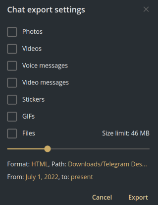
To calculate it the chat history of almost a half year has been downloaded by the convenient export function. Then explored and prepared data converting its types and dropping unnecessary fields.
Prepare exported data
Read and convert text to a DataFrame.
import json
import pandas as pd

with open('ChatExport/result.json') as file:
    data = file.read()

jdata = json.loads(data)
messages_df = pd.json_normalize(jdata['messages'])
Explore data
Make a short general table view of the small data portion.
Start with filtering out missing data, type conversion and samples.
Missing values
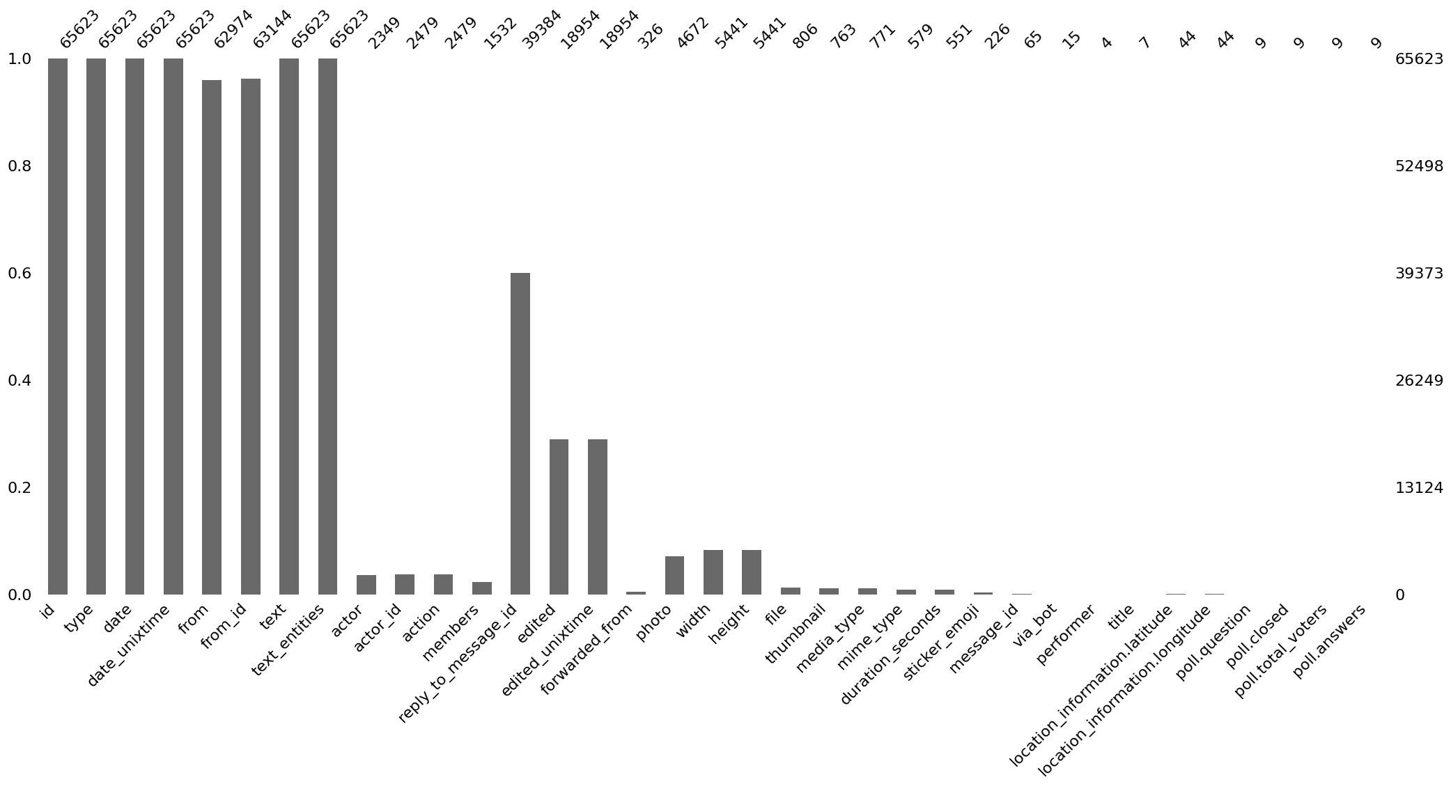
The great utility for this purpose is missingno . It visualizes the missings for you as matrix, bar, heatmap, dendogram.
import matplotlib.pyplot as plt
import missingno as msno

msno.bar(messages_df)

plt.show()
Anonymization
Hide the actual names and IDs faking them with mimesis .
On the missing data chart, there are only the first 8 columns full of data, therefore the others can be dropped.
import mimesis

def to_md(df, index=False):  # helper function to represent DataFrame as a Markdown table
    print(df.to_markdown(index=index))

columns = messages_df.loc[:, 'type':'text_entities']
sample = columns.sample().transpose()
sample.loc['from'] = mimesis.Person().full_name()
sample.loc['from_id'] = mimesis.Cryptographic().uuid()

to_md(sample, index=True)
| 43440 | |
|---|---|
| type | message |
| date | 2022-12-21T12:28:44 |
| date_unixtime | 1671600524 |
| from | Caleb Dickerson |
| from_id | aea0ceeb-9174-4bf1-bf79-8d60fee9540d |
| text | Добро, спасибо! |
| text_entities | [{'type': 'plain', 'text': 'Добро, спасибо!'}] |
Types and samples
columns = columns.dtypes
columns = pd.concat([columns, sample], axis='columns')
columns = columns.reset_index()
columns.columns = ['column_name', 'type', 'sample']

to_md(columns)
| column_name | type | sample |
|---|---|---|
| type | object | message |
| date | object | 2022-12-21T12:28:44 |
| date_unixtime | object | 1671600524 |
| from | object | Caleb Dickerson |
| from_id | object | aea0ceeb-9174-4bf1-bf79-8d60fee9540d |
| text | object | Добро, спасибо! |
| text_entities | object | [{'type': 'plain', 'text': 'Добро, спасибо!'}] |
Ok, now we see how data from the exported history looks like.
Top10 leaderboard
The chart displays the overall messages count per user.
All the charts on the objectives are built upon time and user. So from here on out i'm dealing with three columns date, form, form_id. Give them better names.
renamed_df = messages_df[['date', 'from', 'from_id']]
renamed_df = renamed_df.rename(columns={'from': 'user_name', 'from_id': 'user_id'})

leaders_count = 10
leader_indexes = renamed_df['user_id'].value_counts().iloc[:leaders_count].index
top10_leaders = renamed_df[renamed_df['user_id'].isin(leader_indexes)]

names_ids = top10_leaders[['user_name', 'user_id']].value_counts()
anonymized = {'user_name': {v: mimesis.Person().full_name()
                             for v in names_ids.index.get_level_values('user_name')},
              'user_id': {v: mimesis.Cryptographic().uuid()
                             for v in names_ids.index.get_level_values('user_id')}}
top10_leaders = top10_leaders.replace(anonymized)

to_md(top10_leaders.sample(5))
| date | user_name | user_id |
|---|---|---|
| 2022-09-22T14:57:10 | Nicky Prince | b86c8f80-686f-4d72-af98-b3f3ad19656e |
| 2022-12-12T10:58:10 | Jaleesa Barrett | 300604c5-3564-431a-b09c-bf31be86779d |
| 2022-10-19T15:34:31 | Berry Herrera | 71927cb8-9e3f-490c-ae5f-6b67791964dd |
| 2022-07-09T03:00:47 | Nicky Prince | b86c8f80-686f-4d72-af98-b3f3ad19656e |
| 2022-09-15T19:39:32 | Nicky Prince | b86c8f80-686f-4d72-af98-b3f3ad19656e |
import seaborn as sns

order = top10_leaders['user_name'].value_counts().index
sns.countplot(top10_leaders, y='user_name', order=order, palette='Paired')
sns.set_theme(style='white')
sns.set_style({
    'axes.spines.left': False,
    'axes.spines.bottom': False,
    'axes.spines.right': False,
    'axes.spines.top': False
})
sns.set_context({
    'axes.labelsize': 0,
    'axes.titlesize': 0,
})

plt.show()
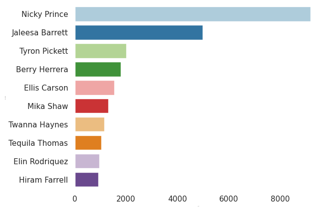
Done. Overall view of the leaders, the top two are the most active:
- The 1st is, obviously, the group owner.
- The 2nd is a regular user and talks much more frequently in comparison to the others.
The color palette Paired is taken for matching leaders pairwise and keeps it constant further.
Time to split it up on facets per month.
Top10 leaderboard per month
Add a month column for pointing it to in the Seaborn facet chart method.
top10_leaders['date'] = pd.to_datetime(top10_leaders['date'])
top10_leaders['month'] = top10_leaders['date'].dt.month_name()

to_md(top10_leaders.sample(5))
| date | user_name | user_id | month |
|---|---|---|---|
| 2022-09-21 01:48:03 | Nicky Prince | b86c8f80-686f-4d72-af98-b3f3ad19656e | September |
| 2022-12-03 23:24:58 | Tyron Pickett | e1073fd1-2ca9-43fb-90d3-48aeb4d9b061 | December |
| 2022-09-02 14:27:54 | Jaleesa Barrett | 300604c5-3564-431a-b09c-bf31be86779d | September |
| 2022-07-26 13:05:15 | Tyron Pickett | e1073fd1-2ca9-43fb-90d3-48aeb4d9b061 | July |
| 2022-08-25 01:39:11 | Nicky Prince | b86c8f80-686f-4d72-af98-b3f3ad19656e | August |
fg = sns.catplot(top10_leaders, y='user_name', col='month', kind='count',
            order=order, col_wrap=3, palette='Paired')
sns.set_context({'axes.labelsize': 'medium'})
fg.set_axis_labels("", "")
fg.set_titles(col_template="{col_name}")
fg.despine(top=True, right=True, left=True, bottom=True)

plt.show()
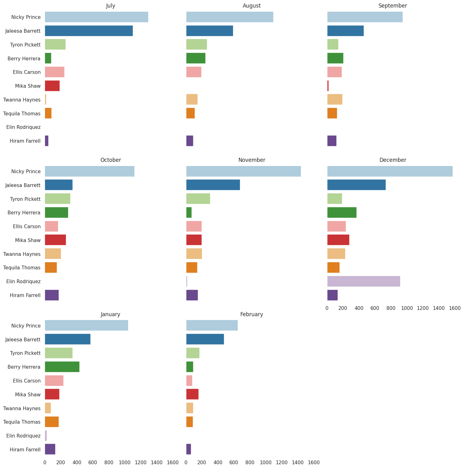
What do i see here?
- The top two hold their places every month.
- In
Decemberthe 2nd leader is changed. And the month is only when the 9th was abnormally active. - The top two prevail over the others' activeness.
- The top two's activeness proportion differs month by month.
- The leaders from 3rd are evenly active.
Top2 leaders message frequency per month
The top two messaged more than others, so plotting a distribution could reveal new activity trends. Data of the others are dropped.
Add a day value for each message to see how it distributes over a month.
top10_leaders['day'] = top10_leaders['date'].dt.day
leaders_count = 2
leader_indexes = top10_leaders['user_id'].value_counts().iloc[:leaders_count].index
top2_leaders = top10_leaders[top10_leaders['user_id'].isin(leader_indexes)]

to_md(top2_leaders.sample(5))
| date | user_name | user_id | month | day |
|---|---|---|---|---|
| 2022-11-02 08:23:06 | Jaleesa Barrett | 300604c5-3564-431a-b09c-bf31be86779d | November | 2 |
| 2022-07-24 22:33:38 | Nicky Prince | b86c8f80-686f-4d72-af98-b3f3ad19656e | July | 24 |
| 2023-02-17 16:00:17 | Jaleesa Barrett | 300604c5-3564-431a-b09c-bf31be86779d | February | 17 |
| 2022-09-03 17:37:39 | Nicky Prince | b86c8f80-686f-4d72-af98-b3f3ad19656e | September | 3 |
| 2022-08-04 23:30:30 | Jaleesa Barrett | 300604c5-3564-431a-b09c-bf31be86779d | August | 4 |
fg = sns.displot(data=top2_leaders, y='day', col='month', hue='user_name', multiple='stack', col_wrap=3, kind='hist', palette='Paired')
sns.set_context({'axes.labelsize': 'medium'})
fg.set_axis_labels("", "")
fg.set_titles(col_template="{col_name}")
fg.despine(top=True, right=True, left=True, bottom=True)

plt.show()
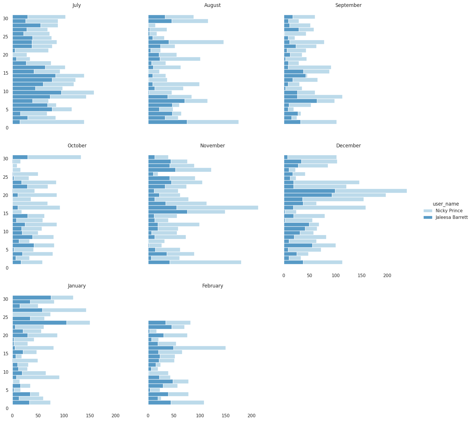
Ok, November and December contain more spikes.
As the leaders are paired, their frequency can be compared side by side relatively.
fg = sns.displot(data=top2_leaders, y='day', col='month', hue='user_name', multiple='fill',
                 col_wrap=3, kind='kde', palette='Paired')
sns.set_context({'axes.labelsize': 'medium'})
fg.set_axis_labels("", "")
fg.set_titles(col_template="{col_name}")
fg.despine(top=True, right=True, left=True, bottom=True)

plt.show()
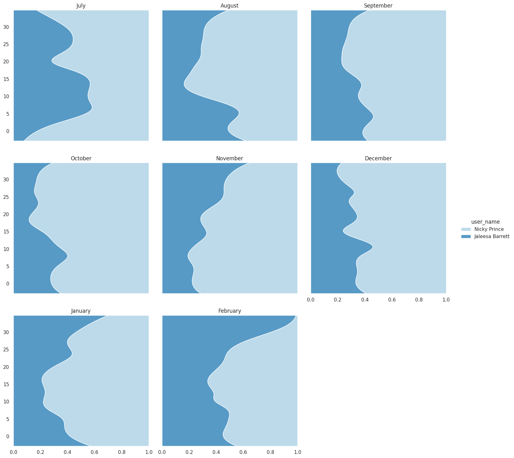
The appearance is intuitive and wordy. The June chart's shape differs significantly.
Afterword
Before getting started, i already knew who talks too much and have proved it by making displaying it with all those charts. Along with it, i got a new understanding of:
- the top two's messages ratio
- the 2nd to others ratio